Ranking Every WNBA Team's Best Jersey for the 2026 Season
This WNBA season has given us plenty to love so far.
This WNBA season has given us plenty to love so far.
We got two new expansion teams with the Toronto Tempo and the Portland Fire joining the league. We're currently being treated to one heck of a final stretch as a slew of teams claw their way around the playoff bubble.
We also got at least one new jersey from each team with the release of the 2026 Rebel Editions. There were many upgrades, a few head-scratchers and some major overall changes for teams around the league.
While we enjoy the playoff race on the court, let's take stock of the state of uniforms around the league. Each team has at least three jerseys in the current rotation: A white Heroine Edition, a bolder colored Explorer Edition and a third Rebel Edition meant to bring in some creativity and local influences. The Sparks, Liberty and Mercury have a fourth Court Origins jersey this year to celebrate the league's 30th season.
Let's rank 'em all. First, we'll pick the best jersey out of each team's collection, then we will pit that jersey against every other team's best jersey. So this is a best of the best jerseys, not a ranking of full sets.
Spoiler alert: The Storm's Heroine Edition was the only Heroine Edition jersey to make this list, and it's clearly at the bottom.
That's not a knock on the Heroine style. The simplicity of the classic whites establishes jersey consistency within the league, and it's a timeless and necessary part of any jersey collection. That is a knock on the Seattle Storm's 2026 Rebel and Explorer jerseys, which are anything but timeless or necessary.
Look, the yellow and green thing stands out. We appreciate a risk and a color scheme synonymous with one team, but it works better accented on a white jersey as opposed to a giant petri dish.
Please don't even start when it comes to the highlighter green Rebels. The Storm's color palette can only be described as "germ," and it's just too much. Achoo!
The Sky first introduced the fun "Skytown" logo as a reference to their "Chitown" home with their 2024 Rebels, and at the time we awarded them with the best jersey collection in the league partially due to the play on words.
To be fair, the ranking system was a bit different two seasons ago: We took the average of all three jerseys of each team, while today we are ranking by the best jersey in each team's collection.
The Sky's jersey collection as a whole is a cohesive, harmless trio, and the Skytown addition was a big jump from their previous third. There's no egregiously bad jersey in there, but nothing stands out. Today's rankings are more forgiving of a dud and emphasize the best singular jersey in each collection.
Still, it's a testament to the growth, innovation, and momentum of the WNBA that the Sky went from first to almost worst in two short seasons. We still like the concept of "Skytown," but other teams' Rebel jerseys got better, while the Sky's got slightly worse.
The change from the milky white and blue color scheme to a solid blue is boring. Now, the black pinstripe jersey from the Explorer Edition is the best in Chicago's set, and that could use an upgrade while we're at it.
We'll be honest, we are absolutely docking the Mercury because all four (4!) of their current jerseys are worse than their former gradient-style Explorer Editions. You had a slam dunk, you have the perfect team and color scheme for a tasteful gradient moment, and you took that magic away from us?
We cannot forgive the Mercury for their decisions, even if their collection as a whole is still pretty solid. Their Court Origins edition is basically the exact replica of their original jersey, and that is what it is.
The current Rebel is the closest we've got to the beloved gradient of yore, so we'll begrudgingly allow it.
Angel Reese breaks yet another WNBA record
The Tempo are here, and they've come bearing sponsors!
At first, we loved their Rebel Edition: Most notably, the speedy T on the Tempo wordmark. We understand—especially in a team's first year—that sponsors keep this thing running. We expect the highs and lows of expansion teams and their first uniforms. Still, the CIBC branding looming larger than the actual Tempo logo on the Rebel Editions is an egregious party foul.
The ad branding is less offensive on the Explorer Edition, and we're partial to burgundy.
There are whispers of Atlanta everywhere throughout this jersey. The lowercase and rounded font of the "atl" heading is clean. The Georgia Peach combined with the big "A" is cute and fun. The peach-colored accents are subtle enough to work surprisingly well with the black and blue color scheme.
This is what the Rebel Editions are all about, and best of all? The sponsor ad is tiny and well-placed.
Let's be real: Would any current Aces jersey move the needle if the team weren't a dynasty? Probably not. Should Nike send A'ja Wilson a bouquet of flowers at least weekly to thank her for the countless iconic moments that have brainwashed us basketball fans into a favorable opinion of these generally bland jerseys? Probably!
Regardless, the Aces did well with their Rebel Edition, and we can't deny the satisfaction of a black, white, and red jersey for Sin City, even if they tend to stick to the script.
The Rebel Edition is also a more entertaining departure from the standard silver, white, and black for the Aces. The font is impeccable and fun without being too cutesy. The nod to the UNLV Runnin' Rebels is undeniable.
The sponsor ad is a little distracting, but less of an eyesore than some others on the list. This jersey is fine-to-good, and we get why a dynasty opts for simplicity, but we'd perhaps like to see something just for funsies from the all-business Aces at some point.
Minnesota's uniforms could never top our uniform lists due to, say it with us, the neon green of it all. Even a speck of that putrid color is going to dock you a bit. The Lynx, at least, incorporate it rather inoffensively.
The lake blue primary color is gorgeous, and somewhat rare in the land of sports uniforms. The Timberwolves and the Lynx did a great job claiming lake blue for the land of 10,000 lakes. The cohesiveness between the two teams, the representation of their state, and the gorgeous color itself almost makes us want to forgive them for the highlighter green of it all.
It's difficult to rank the jersey of a relocating team during its last season in the league. We've appreciated the nods the Connecticut Sun uniforms have given to the Mohegan Tribe over the years, although months of conflict between the WNBA and the tribe leading up to the sale of the team complicates and bittersweetens the gesture.
Business decisions and their fallout aside, the pop of orange the Sun gave this league will be missed. These Explorer Editions also feature the best trim of any WNBA jersey, and it's a pattern formed by Mohegan symbols.
We will miss the uniqueness of this trim.
We love a jersey that jumps out at you before you go seeking it out. That's the 2026 Mystics Rebel Edition, and it's screaming "funky!" "aura!" at us before we even slow down to think.
When we do collect our thoughts, we realize this is extremely different than a typical Mystics jersey. The purple gradient is gorgeous, as is the cursive "District," and the subtle "of change" underneath, but there's more to it.
The jersey pays homage to D.C.'s U Street, the Black Broadway era of the 1920s-'50s, and the many Black women who kept the area running through times of success and of hardship. Read all about it here .
There's nothing better than a Rebel Edition with an awesome backstory and an aesthetically pleasing jersey to match. The Mystics executed that well, here.
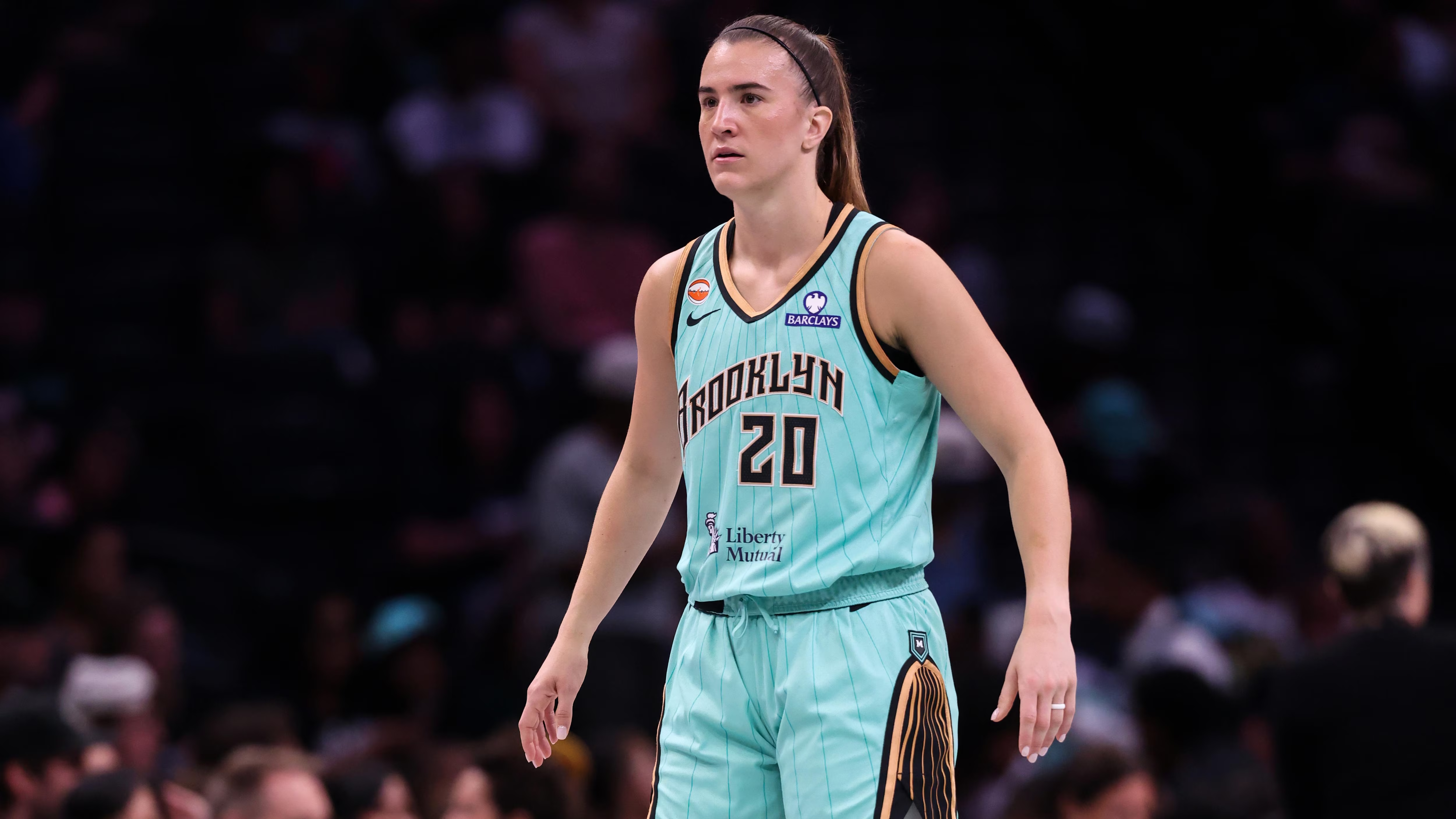
When these were released, we immediately exhaled at the sight of seafoam green. Don't mess with what works, don't mess with what makes you, you. The Lady Liberty seafoam green is synonymous with the New York Libs, and it doesn't hurt that it's a gorgeous and fun color.
We do have to accept the reality that jerseys are going to have ads in our year of the Lord 2026, so it at least gave us a tongue-in-cheek chuckle that Liberty Mutual is the sponsorship patch on this one.
5. Golden State Valkyries, Explorer Edition
If loving violet is wrong, we don't want to be right. We were absolutely delighted to see the Valkyries go all in on the violet colorway with their most recent Explorer Edition.
Violet—or any pastel for that matter—can go wrong if juxtaposed colors and patterns are either too harsh or too subtle. Golden State nailed the details, with tasteful gold accents throughout, and wings beneath the armholes to represent the flight of the Valkyries.
Wait, what did we say about the atrocity that is highlighter green? Forget that when it comes to Dallas-based teams—their city skyline is famously outlined by the color.
In a similar fashion, these Wings Rebel Editions are outlined by the green in all the right places, much like the literal usage of a highlighter pen. Turns out bright green is a whole lot more palpable with a purpose and correct usage.
We love a statement font as well, and this one screams "Texas." Yes, they look similar to the 2022-23 Mavericks City Connects, but they upgraded the concept and the font really seals the deal.
We're suckers for a pop of tasteful novelty, and the tiny basketball embedded in the latest Fever Rebel Editions takes them into the top three. Not only is the patch cute without being annoying, it's also a nod to the team's primary logo.
"Expect to win," the mantra of Fever legend Lin Dunn, is strewn across the shorts. It's a detail that showcases what the Fever do so well when it comes to uniforms: They blend the past, present and future together and mix in a ton of pride for the state of Indiana.
The Indy wordmark is a fun pop that accomplishes all of the above.
The Portland Fire went with an extremely bold homage to the City of Roses for their first-ever Rebel Editions, and boy, did they pull it off.
This isn't your typical rose-themed attire. Portland went with a more subtle pattern of gray roses that seamlessly blend in with the jersey's black background. They saved the red for the outlines and accents, and it all makes the color pop wonderfully. Even the green sponsor ad works to give the jersey a hint of vine to go with its roses.
The kicker is the font, completely leaning into a gothic vibe atypical for a basketball jersey in the best way. It's extra satisfying to see a new team take a risk and watch it pay off.
1. Los Angeles Sparks, Court Origins Edition
Did we mention that we're suckers for a pop of tasteful novelty?
No one has done this over the years better than the L.A. Sparks and their palm tree, and there was no better reminder that the Sparks have been the blueprint than this year's Court Origins Edition.
It's super fun and even a bit emotional to see the iconic teal palm tree worn by Lisa Leslie out there. It's also fun to see the retro design of the jersey itself—don't the length of it and the shoulders just take you right back to the '90s?
The Sparks are always at the top of jersey lists (or at least ours) for good reason: The purple-and-yellow color scheme is synonymous with the area, the palm tree is shameless and it's all somehow cool—just like L.A.
Topics in this story
Gathered from external sources. Rights to this text belong to whoever originally published it.