Interior designers say these colors will make your home look more expensive
"Quiet luxury" may be the goal, but these elevated color palettes are definitely loud — in the best way.
Our experts independently review everything we recommend. If you buy through our links, we may earn commission.
You don't need to fill your house with pricey furnishings to make it look rich. Nope, I talked to several interior designers and they all agreed that a carefully chosen color palette is the easiest (and most affordable) way to elevate a space.
Grays, beiges and whites have long signaled sophistication, but that doesn't mean you can't achieve a "quiet luxury" look with bolder shades. In fact, most of the colors the designers recommended read moodier, yet are just as grounded (that's a hint!) and versatile as more understated neutrals you'd expect on this list. Here are the high-end hues pros turn to time and time again.
Chocolate brown is a softer, warmer alternative to black. "It adds depth and drama, but doesn't look as harsh," says Katie Webster, a color consultant at A Season for Home . Drenching the walls in espresso tones is always an option, but Webster maintains it can still make a big impact when used sparingly. "Use it on your millwork for a sophisticated update," she says, adding that it's a relatively simple way to make any room "look instantly more high-end."
Double down on the drama by selecting a nearly-black brown paint. Webster is a fan of Sherwin-Williams Clove because "it looks stunning with low-chroma green (like Creekside Green by Benjamin Moore )."
Neutrals get a bad rap for being basic and boring, but nearly every interior designer I spoke to said they are the easiest way to elevate a space. Warmer colors are key here — trade crisp whites and cool grays for more lived-in hues like this soft ivory used by Brooke Howard Interiors.
"I love starting with a warm foundation — think medium to dark brown hardwood floors, soft off-whites instead of stark builder-grade whites and warm metals — and then bringing in some of your favorite colors through fabrics, wallpaper, artwork and accessories," says Brooke Howard, principal designer at Brooke Howard Interiors . This approach makes any room feel "collected and intentional rather than overly matched or trendy."
Light fixtures and hardware finishes should skew warmer too. Howard recommends replacing cool chromes with brass and brushed nickel. "That consistency makes a home feel elevated and thoughtfully designed," she says.
Threshold with Studio McGee Checkered Ottoman
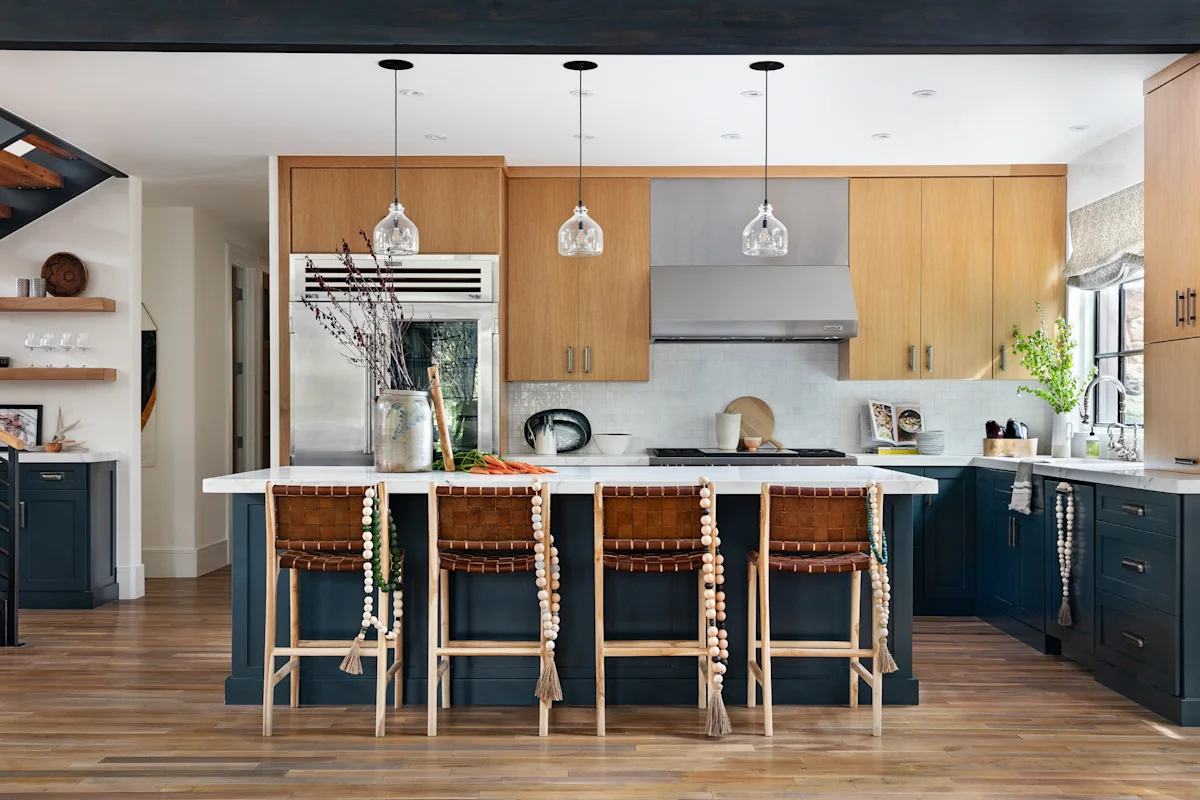
Navy is a gateway color, according to interior designer Stephanie Hunt . It's a nice switch-up from more understated neutrals, but Hunt says it's equally as timeless.
"The key with a color this rich is balance," adds Janelle Patton, principal designer and owner of Lark Interiors . Use it as an accent like Hunt did in this two-tone kitchen ("I like to paint the lower cabinets a color that feels grounded.") or carry the color from floor to ceiling for maximum impact. "Pair it with warm woods, natural stone, brass and lighter textiles to keep the room feeling layered and inviting rather than dark or overly formal," says Patton.
Green has evolved from an accent to the anchor. "It feels warm and natural without being beige," says interior designer Barrett Oswold . Sage is a gentler entry point, but Lindsay Olson of Lulu Designs argues that "nothing reads more expensive to me than a deep olive green paired with warm cream."
Like navy, Oswold says that "olive has the depth of a dark neutral without the heaviness of black." Lighten it up with cream furniture, lighter woods and unlacquered brass, which Olson says will "age the room in the best way." Round out the space by mixing in some natural materials, like wicker, wool and linen "to keep the color from feeling too forced," per Oswold.
Siloloom Washable Vintage 2x6 Runner Rug
Serena & Lily Brooks Fluted Cordless Table Lamp
Navy delivers drama and depth, but a more balanced blue evokes a sense of calm. "A soft, slightly gray-blue can feel very sophisticated, especially when you use it on everything rather than treating it like an accent color," says Oswold.
In this living room, Oswold painted the walls, molding and architectural details in Sherwin-Williams Misty , which she says "made all of the existing millwork feel special without making the room feel too formal."
This pairing is high contrast — and high reward. "Black and white is crisp, sleek and will never feel trendy. It's like a good denim shirt" says Alexa Harris-Ralff, principal designer and founder of AHR Designs .
A few pops of black bring restrained boldness to an otherwise light and bright room. Warm white walls set the tone — Lauren Lerner of Living with Lolo frequently uses Benjamin Moore White Dove "to avoid the flat, builder-grade feel that stark white can create." Complete the space by replacing basic brass and chrome fixtures with matte black or aged bronze options, a seemingly simple swap that she says "shifts a space from ordinary to elevated."
You can also take this color combo to your stairway. Harris-Ralff loves using black paint — specifically, Sherwin-Williams Tricorn Black or Benjamin Moore Black — to breathe new life into an old bannister. "It's a nice place to offer a little contrast and some gloss," she says.
Kakanuo Rechargeable Table Lamps, 2 pack
Porlien Checker Porcelain Flower Vases, 2 pack
Topics in this story
Gathered from external sources. Rights to this text belong to whoever originally published it.