What Bollinger Bands Are Saying About Stocks Right Now
SPX stocks are flashing oversold Bollinger Band signals even while the index is near record highs
The indicator that caught my eye this week is good ol' Bollinger Bands. Bollinger Bands are one of the most popular technical indicators and are available on any charting software that I've seen. Bollinger Bands typically use a 20-day moving average as the centerline, and upper and lower bands are drawn two standard deviations above and below the moving average. The conventional way to interpret the indicator is that when the stock closes below the lower Bollinger Band, it's oversold. When it closes above the top band, it's considered overbought.
What caught my eye was that at the close on Monday, the S&P 500 Index (SPX) was within 1.5% of its all-time high, but many stocks had Bollinger Band signals, and a large majority of them were to the downside. I wondered if this was common and if it could tell us anything about what to expect from the market going forward.
Also, one of the largest and most popular stocks, Apple (AAPL), was one of just a handful of stocks that recently signaled above its top Bollinger Band. In the article below, I dig into AAPL's historical signals to see how the stock tends to perform based on the indicator.
On Monday, the SPX was still within 1.5% of its all-time high (it fell below that today). Over the previous 10 days, there were over 100 Bollinger Band signals, and over two-thirds of those signals were stocks closing below their lower Bollinger Bands, as opposed to closing above the top bands.
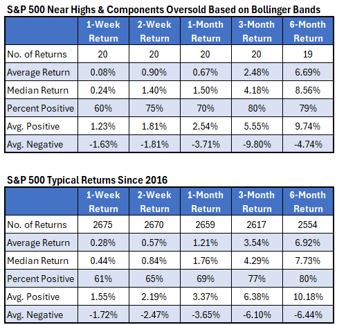
Going back to 2016 and using the criteria above (SPX within 1.5% of the high, over 100 Bollinger Band signals, and over two-thirds of them oversold), there have been 20 previous signals. To avoid bunches of signals, I only considered the first signal over a 20-day period. The table below summarizes the SPX returns after these signals. The second table below shows typical index returns for comparison.
Looking at the table below, there's slight outperformance two weeks after a signal but underperformance one and three months after. The two-week returns show a higher-than-normal percentage of positive returns, with less volatility based on the average positive and negative returns. The higher percentage of positive returns is the reason for the outperformance.
The underperformance at one and three months is not due to fewer positive returns (the percentage of positive returns is about the same as usual). The underperformance was due to less upside at the one-month time frame, and then at three months, it was due to less upside and more downside.
Topics in this story
Gathered from external sources. Rights to this text belong to whoever originally published it.